INK Tank
A Mobile UX/UI Design Case Study
This was my first ever case study and experience with UX/UI Design and was done through Career Foundry to receive my UI / UX Design Certification.
Ux/Ui Designer
November 2018 ~210 hours

Design Process
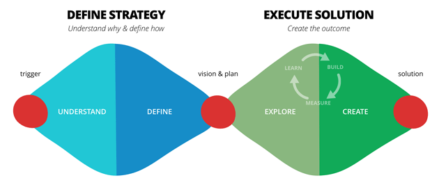
I opted to use the double-diamond strategy when it came to designing INK TANK. It is a great process to use because it allowed me as a designer to ideate from an objective point of view. An unbiased viewpoint when it comes to design is always the best because it allows the designer to create a solution that really is user-focused rather than opinion-based. Not only this, but it helped to keep me on track. With so much ideation can often come wasted time on tangential ideas, but with the double-diamond, I was able to expand my work in the understanding and exploring phases, but lead me to narrow my focus when it came to defining the problem and creating a solution.

Understanding the user
Competitive analyses
As part of the understanding phase, in order to better understand the problem, I investigated other competitor apps in the market. This is extremely useful, because it provides insight into what user’s in that market are looking for, to be able to see where there are holes in their products that I could take advantage of, and to develop a strategy based off of those findings.
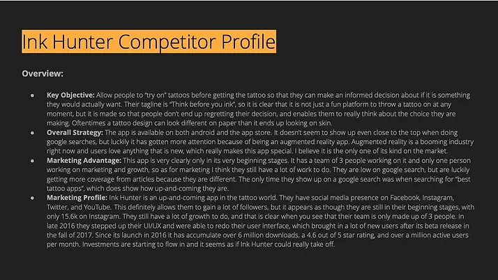
I gathered information based off of other competitor apps in the tattoo world. I chose two competing apps, Tattoodo and Ink Hunter.
When investigating these competing apps I used two different forms of profiling: a competitor profile and a SWOT profile. The combination of these tools is great because hand-in-hand they create a really well-rounded competitor analysis. The SWOT profile pulls in great surface information that I can identify quickly just scrolling and clicking through their apps and websites. Whereas the competitor profile allows for a bit of a deeper dive, identifying the “why?” behind their product and how they are targeting their users. Pairing both the competitor profiling and SWOT profiling was a very useful tool in the “understanding” phase of my project.


user Research
After exploring the world of research methods (learning about attitudinal vs behavioral, qualitative vs quantitative, and generative vs evaluative), I began my research phase with the goal to confirm and further define the issue at hand.
My research goals:
-
To understand the general attitude towards tattoo apps, and how they help or hinder the tattoo process.
-
Determine how users go about finding tattoo designs.
-
Determine how users find a tattoo artist or shop that meets their expectations and needs.
-
Identify the downfalls in the tattoo process.
-
Identify what solutions could help to rid the process of these downfalls.
In the end, I chose to go down the path of doing both user interviews and user surveys. Although, I juggled the option of doing contextual inquiries as well, I was concerned that because it requires more observation of the user that it would alter their “natural state” which would not provide the information I was looking for. The reason I opted to do surveys was because they are always a great way to collect a mass quantity of feedback, with minimal effort on the designers part. It was an easy way to identify the likes and dislike of user and what their expectations were. With a large collection of data I was able to see the correlations in data, and see what the majority of people’s need and wishes were. Additionally using the interviews, unlike surveys where the individuals aren’t as targeted, I was able to pick and choose individuals that I knew were a part of my target market.
With my information gathered from the interviews and surveys, I did some user research analysis. When it comes to research analysis, the main goal is to identify any trends and thus define the objective of the project. In order to analyze my research, I used affinity mapping to visualize the data. This was a great method because it helped me to dig through the small mountain of information I had and group it so that it showed clear themes. Once I gathered the themes by individuals, I then grouped them based off of behaviors, needs, frustrations, facts, and quotes.


With these findings, I had a greater understanding of who I was working with. I was ready to create some user stories, user personas, mental models, and user journeys.
Each of these tools is fantastic for further understanding the user and their goals.
User stories specifically come from the agile framework, which aims to break down the user goals into bite-sized pieces.
User personas then take these requirements and turn them into a person that acts to represent the target market of the product. This was one of the most important tools early on because it was something that I was always able to look back on to make sure I was staying in-line with user needs.
Mental models were integral in creating empathy for my personas. I was able to put myself in their shoes and begin to really understand what they want to accomplish. Mental models help to create confidence and validation within the future designs. User journeys are then the visualization of this information.


Defining the problem
problem statement
Tattoo enthusiast needs a way to search for creative, unique tattoo designs and artists/shops that have the same goals and vision because they want to optimize their experience and decrease the chance of regret or dissatisfaction with their future tattoo.
proposed solution
Create an interactive platform that has a beautiful and modern interface where users can easily search through (as well as upload to) an archive of general tattoo designs of all different genres as well as finding shops and artists that meet the users vision (clean, quiet, alternative,etc), at which point they can then peruse the portfolios of a variety of artists and their past works. I think another great idea would be to include a sort of quiz at the beginning (like you may find on a fashion website, where they try to identify your style) that will identify which genre would be best fitting for the user.
Exploring Solutions
From this point, I had all the information I needed to be able to create a refined sitemap through the process of card sorting, and move into the execution phase.
Card sorting was a method of participatory design that I used to see how users would create a structure to the product, without them directly knowing that is what they are doing. Using their own logic, they generate a structure from the content provided.


Now that I had defined the information architecture of the app, it was time to move into the exploratory and creative phase, where I get to pull out my artistic and imaginative toolkit to create digital solutions.
I started with some low-fidelity sketches to get a better idea of which direction I wanted to go with the UI design. Through many rounds of iterations, I created mid- and high-fidelity wireframes, eventually being able to create an InVision clickable prototype as my minimum viable product.


in-person user testing
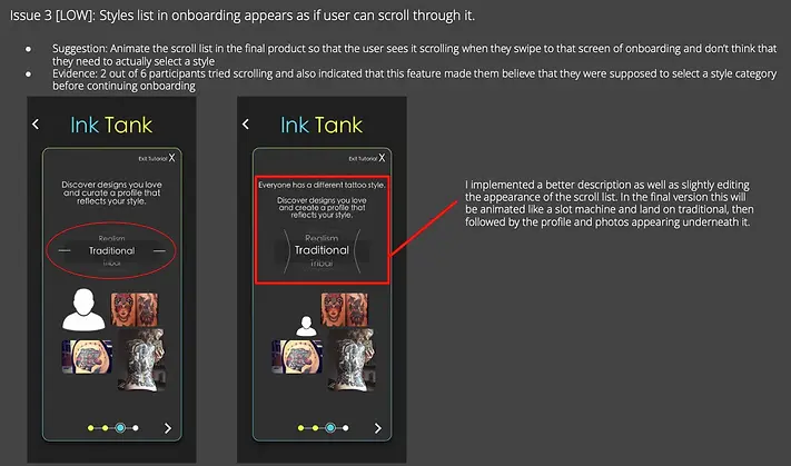
User testing is when the evaluative form of research came in to play. Evaluative research, in comparison to generative research (interviews, card sorting, etc), happens once a products exists that is viable enough to be evaluated. In addition to wanting to do moderated in-person usability testing (because they are useful when a product is in its early prototyping stage), I also explored different evaluative research methods ranging from eye tracking and ethnographic field studies to A/B testing. I landed on A/B and preference testing because they provide a large amount of definitive answers in a short amount of time.
Goals: The goal of this test is to determine the desirability and functionality of INK TANK. As I was breaking into a market that had long been set in its ways, it was very important that I determined if this is really what the tattoo community wanted, and in the case that they did want it, to determine if it is exactly what they are looking for. This allowed me to see further into the desires of the community and create a product that they really saw fit.
objectives
-
Observe the user’s body language and emotional reactions to the app to determine the value they see in it
-
Can users successfully navigate their way through the app (specifically the explore page and user profile)
Findings & Changes


A/B Testing


After going through a few more touch up iteration rounds, using grids, and refining the designs based on the iOS Human Interface Guidelines, I reached my final UI Designs.
final designs


Final Prototype
Design system


